The Story Behind Sugar Neon
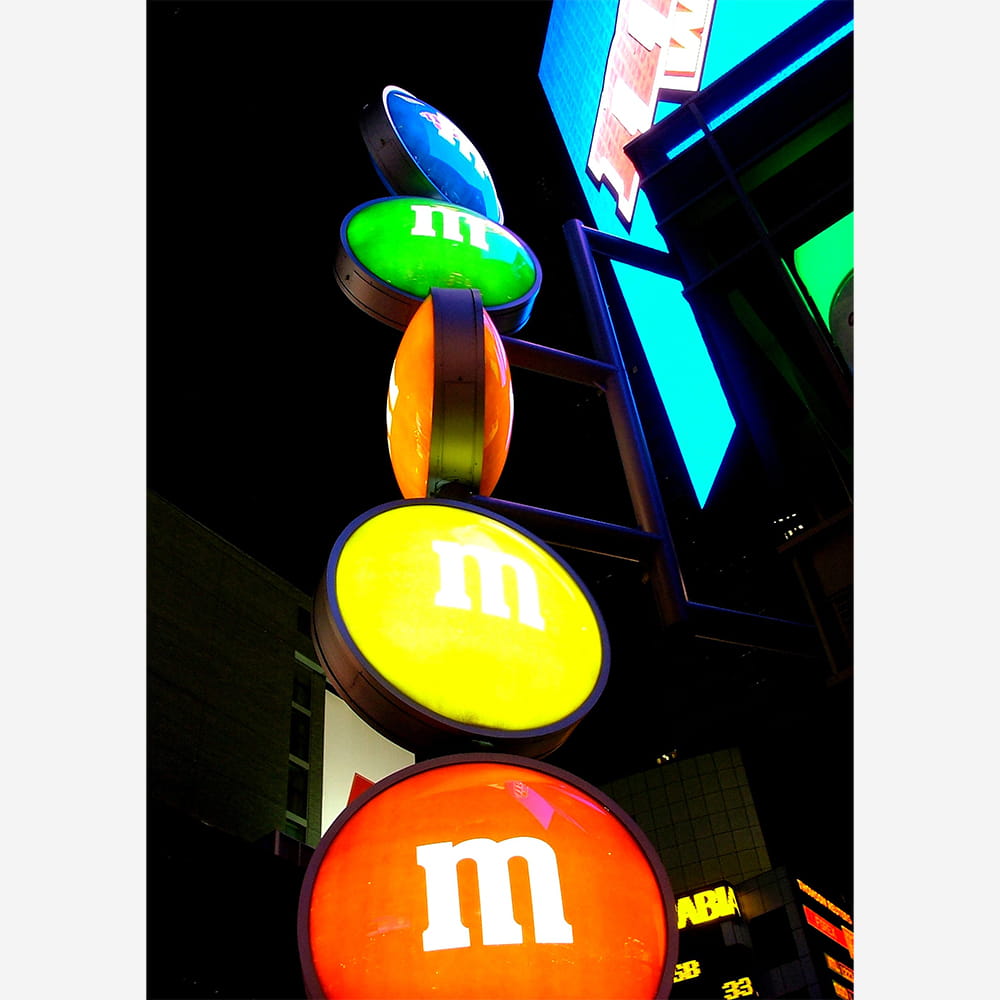
SUGAR NEON: The vibrant M&M sign in Times Square, NYC
There is a specific frequency of light that only exists in Times Square at night. It’s a jittery, electric hum of cerulean, cherry red, and high-vis yellow that cuts through the Manhattan humidity. In the middle of this sensory overload stands an icon of Americana that manages to hold its own against the towering digital billboards: the vertical, glowing stack of the M&M’S World signage.
A Beacon of Classic Signage
The image above captures more than just a storefront; it captures a masterclass in classic brand identity. While the world moves toward minimalist flat design and soulless digital screens, there is something deeply satisfying about the physical geometry of these glowing lentils. They mimic the “spectaculars” – the giant neon signs that defined the golden age of Broadway.
Stacked like a colourful totem pole against the obsidian New York sky, these discs are a reminder that some of the best night time photography doesn’t come from nature, but from the artificial “sun” of the city. The way the light bleeds off the edges of the green and yellow “m”s, reflecting off the steel structures behind them, creates a depth that a flat LED screen simply can’t replicate.
The Architecture of Chocolate
When we think of chocolate, we usually think of comfort, warmth, and indulgence. But in the context of Times Square, M&M’S are transformed into architectural elements. This signage serves as a gateway to 25,000 square feet of confectionery chaos.
- The Colour Palette: The primary colours used in the signage are intentional. They tap into a collective childhood nostalgia, making the brand feel both timeless and incredibly modern.
- The Perspective: Shot from a low angle, these candy pieces look like celestial bodies orbiting a skyscraper. It’s a perspective that makes the mundane (a confectionery shell) feel monumental.
- The Contrast: The sharp “m” typeface provides a crisp contrast to the soft, rounded glow of the circular light boxes, a hallmark of mid-century advertising design.
Why It Works: The Americana Appeal
M&M’S are a quintessential piece of American culture, originally created in 1941 for soldiers to carry chocolate that “melts in your mouth, not in your hands.” Seeing them towering over 48th Street feels like a victory lap for a brand that has survived every trend.
At night, the store becomes a cathedral of sugar. The glow from the signage acts as a lighthouse for the millions of tourists seeking a familiar face in a city that can often feel overwhelming. Whether you’re a photographer looking for that perfect high-contrast shot or a traveller looking for a souvenir, that vertical stack of “m”s is an undeniable signal that you’ve truly arrived in the centre of the world.