The Story Behind Blue Sky, Hot Chips
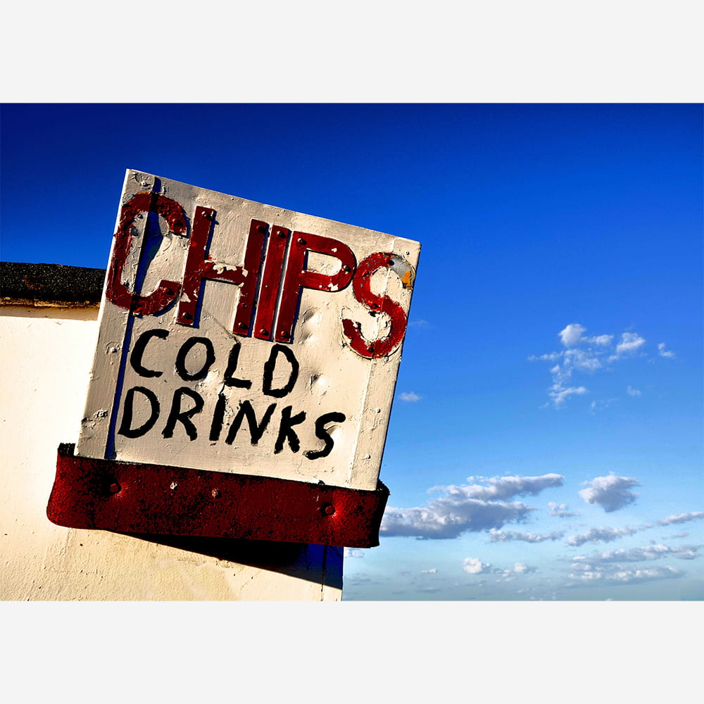
BLUE SKY, HOT CHIPS: Old sign on the Kent coast, UK
The Texture of Nostalgia: Finding Beauty in the Coastal Decay
There is a specific kind of magic that happens when a high-noon sun hits a faded seaside town. As a photographer, I’m often drawn away from the pristine, postcard-perfect views and toward the edges—the places where the salt air has spent decades chewing on wood and metal. This single frame of a weathered “CHIPS & COLD DRINKS” sign captures the very essence of the British seaside: a grit-teeth optimism that persists through every passing season.
The Palette of an Endless Summer
The first thing that grabs you is that unapologetic blue. It isn’t just a sky; it’s a saturated canopy that feels like it’s been pulled straight from a Kodachrome memory. In photography, we often chase the “golden hour,” but there is something to be said for the harsh, direct light of a long summer day. It flattens the world, turning the sky into a solid block of colour that forces the subject in the foreground to pop with graphic intensity.
Against that sapphire backdrop, the former white and rusted red of the sign create a primary colour triad. It’s a visual language we all understand: the colours of a beach day, the colours of a holiday that feels like it might never end.
The Art of Decay
Look closer at the lettering. This isn’t a modern, backlit vinyl print; it’s hand-painted, tactile history. As a photographer, texture is the narrative.
- The Peeling Paint: Every flake of white lifting off the board tells a story of relentless sun and gale-force winds.
- The Rust: That deep, oxidised red at the base of the sign provides a grounded, earthy contrast to the ethereal sky.
- The Typography: The slightly irregular spacing of “CHIPS” feels human. It reminds us of a time before everything was digitised and uniform.
In photography, “perfection” can often be sterile. But decay? Decay has character. It shows the passage of time. It reminds us that while the day might be beautiful now, this sign has stood guard through a thousand rainy Tuesdays in November.
A Sensory Snapshot
While a photograph is a visual medium, the best shots trigger the other senses. When I look at this image, I don’t just see a sign; I can smell the vinegar-soaked paper of a bag of chips. I can hear the distant, frantic cry of gulls and the rhythmic hush of the tide. I can feel the heat radiating off the white wall and the slight stickiness of a cold lemonade can in a sand-covered hand.
The composition – slightly angled, looking up – gives the sign a monumental feel. It’s an altar to the simple pleasures of summer. It captures that specific childhood feeling where the most important decision of the day was whether to get a flake in your ice cream or an extra portion of salt on your chips.
Final Thoughts
This image is a reminder to look for the “beautifully broken.” The next time you find yourself at the coast, don’t just gaze at the horizon. Turn around. Look for the peeling paint on the pier, the sun-bleached menus, and the rusted bolts of the promenade. That’s where the real memories live; in the lovely, crumbling details of a summer well-spent.